Back
mobile and desktop website mockup

The Rose Family Bakery Website UX Design

Project Overview

Project Date: 2023

The Rose Family Bakery just opened its first storefront in Tempe, Arizona! The owners wanted to take the next step and build an e-commerce website, and it was my job to develop the site's user experience. After some research and a site plan, I created mobile and desktop wireframes. The wireframes needed to be ready for development, so every possible interaction had to be accounted for. Once the UX was nailed down, I developed a mockup for the landing page to offer my clients a possible creative direction.

Mobile Wireframes - Figma Desktop Wireframes - Figma
Understanding Our Target Audience

Developing personas

Before I began designing the website, I first created three proto personas. Each of the three personas represents a type of person who is likely to use the bakery's website.

Personas & Empathy Maps.pdf
Young asian male with glasses in a light blue t-shirt
Steve the Student

The first of the three is Steve the Student. He is a local college student who values convenience, variety, and mobile usability. He often forgets when his order will be ready for pickup or delivery, and appreciates a friendly reminder.

Young white woman wearing a dress
Rachel the Receptionist

Rachel the Receptionist is a newly married Tempe resident. She values reliable pickup and delivery options, and baking tips and tricks. Rachel frequently picks up orders for her office on her way to work. She finds it difficult to place large orders on e-commerce websites.

Middle-age woman wearing a black shirt
Mary the Mom

Mary the Mom doesn't have much time to bake, but she and her family love pastries. She values clearly marked allergens, custom order options, and special deals. Mary wants an easy way to request custom orders. She often buys cakes and cupcakes for her kids birthdays.

Organizing The Site Content

The Site Plan & Navigation

Since the bakery did not have a website before, it was necessary that I start with a site plan. The site plan illustrates the organization/hierarchy of the website. It shows how pages relate to each other.

Site Plan.pdf
site plan diagram

01. Designing The Checkout Process

Design Solution

The checkout process is an important experience to get right for an e-commerce website. It must be easy to purchase the products.

The prototype showcases one possible checkout process a customer might take. I designed this experience to involve as few steps as necessary to complete a transaction. There are only two screens in the checkout process, one to input delivery or pick up information and another to input payment information.

Checkout Process User Flow.pdf

02. Placing A Custom Order

Design Solution

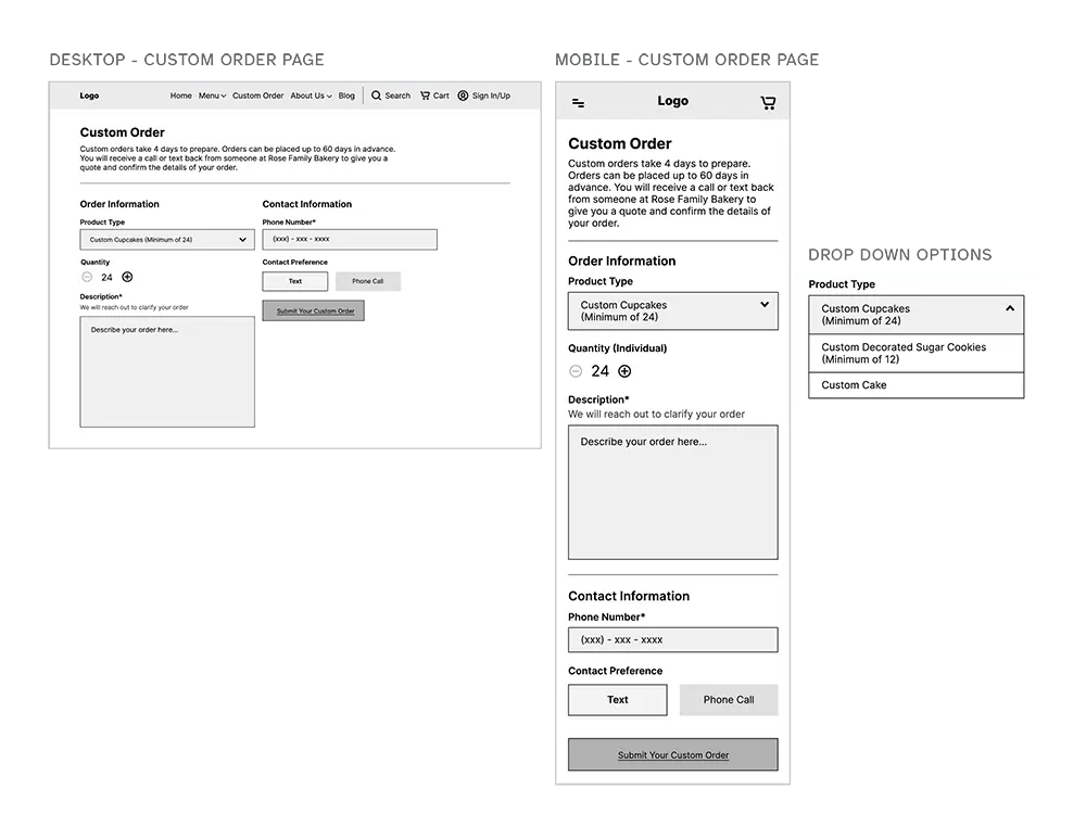
I created a separate page for custom order requests, and I included it in the global navigation. Customers have the option to click or tap on “Menu” to view standard bakery products. However, if the user wants to place a custom order, all they have to do is click or tap on “Custom Order” in the global navigation.

I did this to minimize confusion, and to create a flatter navigational hierarchy. A flat navigational hierarchy means that there are more links visible to the user at all times. This can create a better user experience, especially on sites with many products.

Custom Order Screens.pdf
Custom order wireframe screens

03. Signing Up For An Account

Design Solution

Allowing the user to create an account was an important requirement for this site. The user can sign up for an account from the global navigation and/or during the checkout process. The prototype showcases the sign up process during the checkout flow.

User Account Screens.pdf

04. Viewing Products

Design Solution

It is important that users can access the products through multiple paths. The customer should be able to view a product individually; they should also be able to find the product through categories and search results.

This prototype showcases how a user might find a product by looking under a category, "Decorated Sugar Cookies".

Design Direction

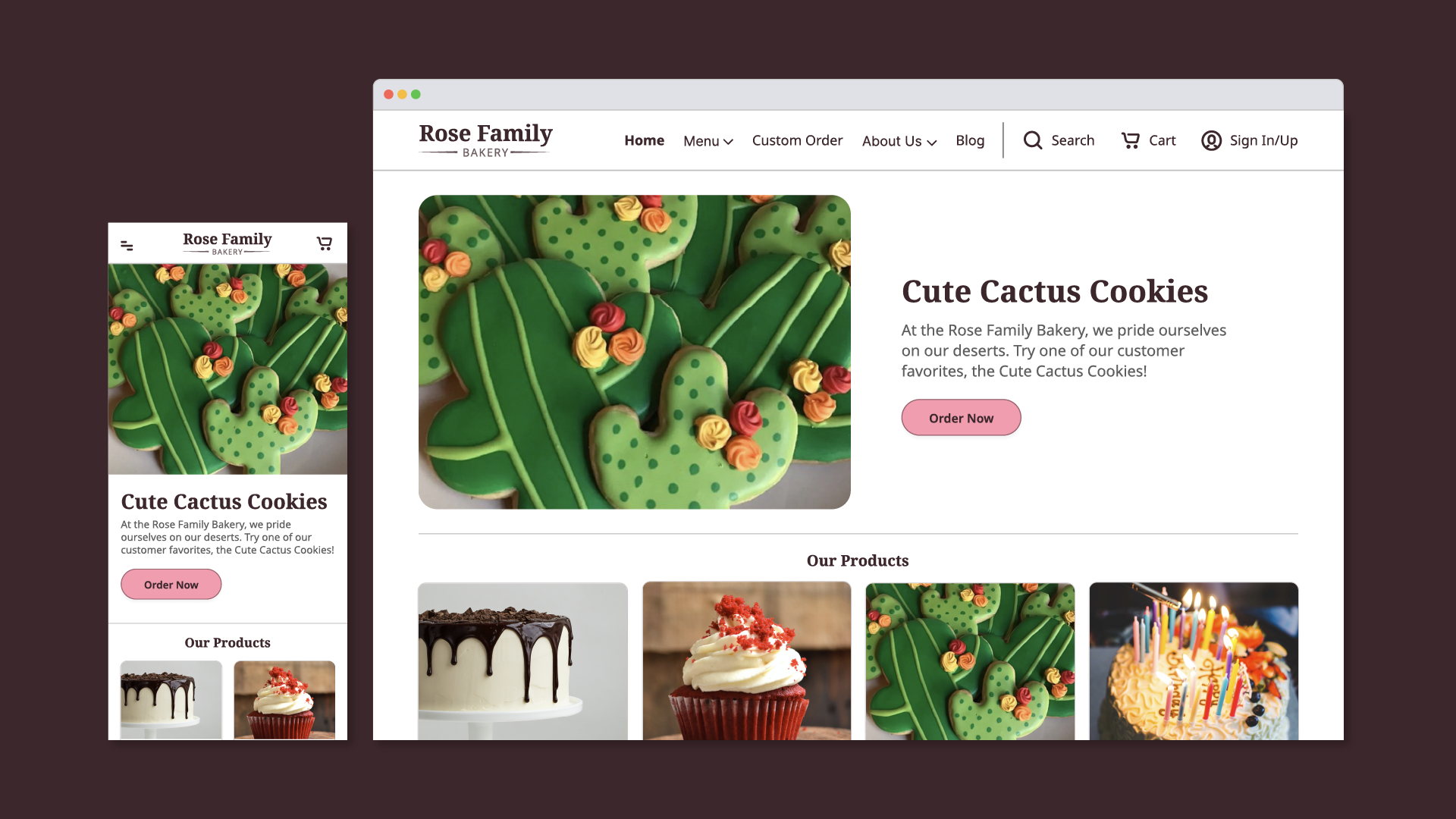
Although the user interface design of the website was outside the scope of the project, I designed a mockup of the home page to provide my clients with a visual design direction.

mobile and desktop website mockup

Reflection

As I look back on this project I am pleased with the outcome and the process I took to get there.

In the past, my wireframes did not account for every possible user interaction. However, with this project, I needed to hand over wireframes that were ready for development. I needed to anticipate and answer as many developer questions as I could.

I do wish, however, that I had more time for user testing. I was not able to conduct a thorough usability test on the wireframes due to time constraints.

Top of Page